Prepear app fight with apple over logo
I heard about this in instagram the other day; Prepear, a recipe and meal-planning app, has agreed to change its pear logo to settle an ongoing trademark dispute with Apple, Prepear's co-founder today confirmed to iPhone in Canada. Apple in August opposed Prepear's trademark application, claiming that the company's pear-shaped logo was too similar to Apple's own logo. more about it on this link
So. As you can see this logo is in desperate need of a makeover. Given the dispute is the perfect opportunity for a pro-bono logo.
So let’s see what we have for the brie; 1. Project: Branding. 2.Product: mobile app with recipes. 3. Great name. PrePEAR
Bright Green = Great for contrast; Round relatable shapes = Pears
Consideration: Mobile app = UI environment. Icon styles.
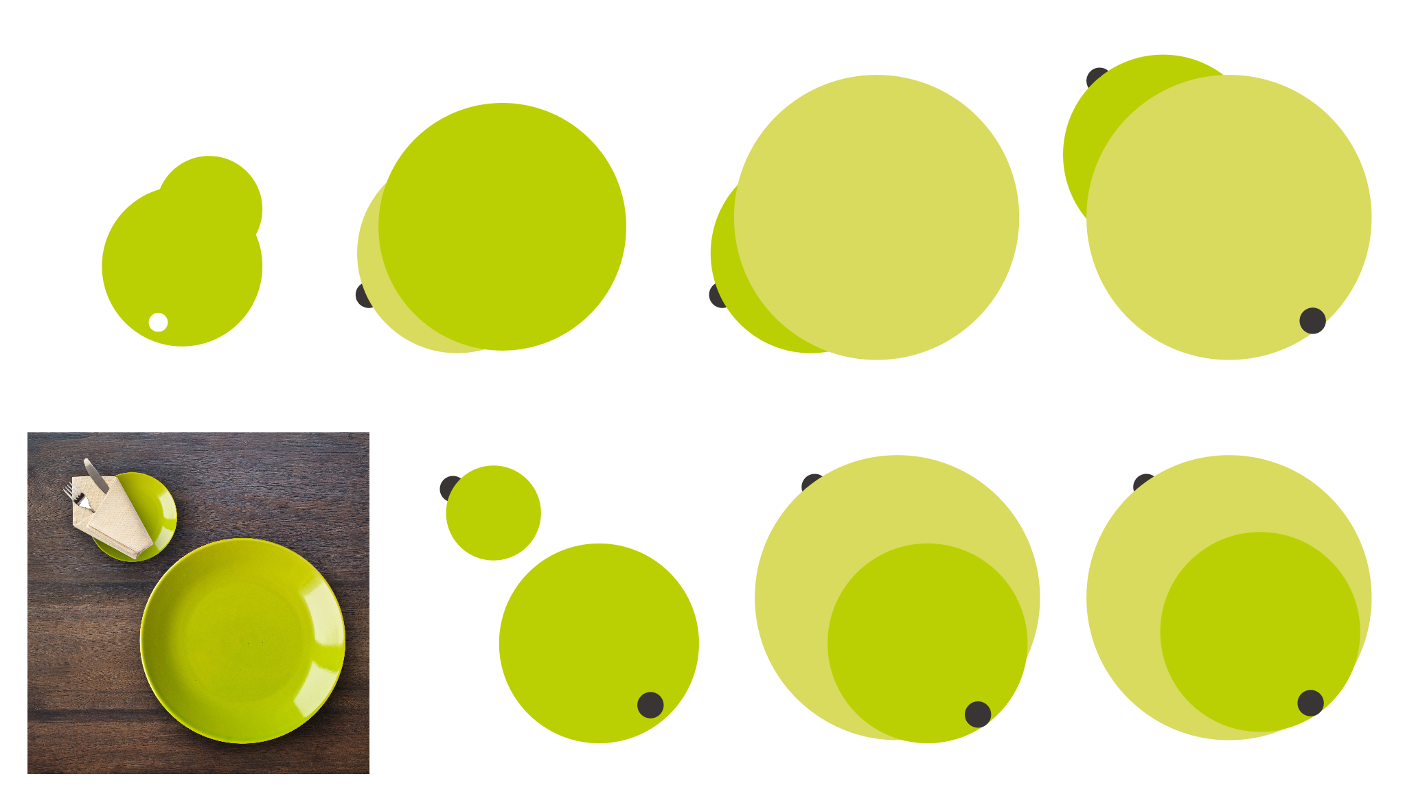
Drawing school. Basic shapes help compose complex objects.

oh right, now we got something good, let’s try it on a system.

- Sweet!!! Not doing the icon because it’s implied ;)
Notice that I never got to show it the PrePear peps. I did this for the fun of it. But what I know is that you should never do these for free ;)