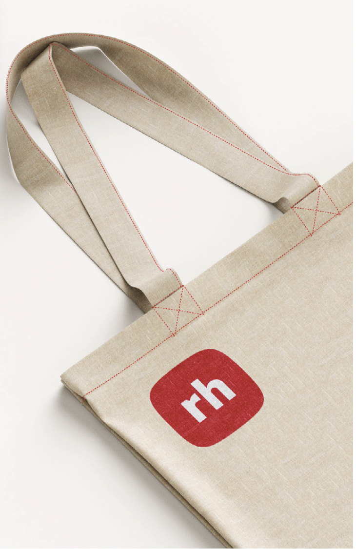
Corporate branding with a digital overhaul
Over the past decade, this traditionally conservative brand has over-used its brand assets, which were primarily built for print media. As a result, they are now overdue for a visual intervention. In 2020, Robert Half Inc. made a decisive move into the automation and remote services era. Consequently, the brand requires fresh assets that can seamlessly adapt to the ever-evolving digital landscape.
Our mission is to elevate this brand from its current financial corporate aesthetic and introduce a revitalized version that places people at the forefront.
We aim to create a more approachable and insightful brand identity that resonates with the modern era, aligning perfectly with Robert Half Inc.'s forward-thinking vision in the dynamic digital realm.
The approachable expert

The “Approachable Expert” concept as a brand personality descriptor is the distilled idea of all the best qualities of our products and services connected to our audience’s insight. This direction laid out a canvas of opportunities for the Robert Half brand to maintain its hard-earned reputation over the years as we move forward in a constantly evolving market reality.
“My creative vision, in simple terms, was to improve the brand's look and feel by completely changing the use of colors and the layout grid by including new rules and avoiding boxes.”
-
Mobiel First
A design approach or best practice in product design. It requires a flexible and scalable branding strategy to adapt to various screens and resolutions. A mobile-responsive brand ensures integrity and consistency while preparing for evolving digital environments. Crafting a flexible branding strategy keeps businesses relevant, visually appealing, and future-proof across diverse platforms -
icon
In digital design, visual hierarchy directs user attention for better engagement and brand communication on mobile devices. A clear and consistent system, scalable for different screens, ensures accessible information and reinforces brand identity across digital platforms. It's the foundation for effective communication in the dynamic digital landscape. -
icon
Understanding performance is crucial in digital design, impacting user experience and engagement. An efficient visual system should consider factors like page load times, image optimization, and responsive design for seamless performance. Prioritizing performance enhances satisfaction, search engine rankings, and conversion rates. By mastering performance in digital design, businesses create captivating and high-performing online experiences that deliver tangible results in the competitive landscape. -
icon
Visual consistency is pivotal in a digital system, building coherence and trust. When design elements like colors, typography, and imagery harmonize across a site or app, it fosters a familiar and user-friendly experience. This consistency boosts brand recognition, simplifies navigation, and enhances engagement, leaving a positive impression and strengthening credibility. -
icon
Brand experience consistency is key to trust-building, reputation enhancement, and lead generation. A uniform presence across all touchpoints signals dependability and professionalism, reassuring existing customers and attracting new ones. This reliability cultivates a positive reputation and encourages user engagement, resulting in increased lead generation. A consistent and trustworthy experience strengthens brand recognition and fuels growth. -
icon
Understanding brand-user interactions shapes the user experience. Beyond aesthetics, it's about strategic alignment across touchpoints, crossing the marketing funnel. This personalization enhances engagement, fosters a deeper connection, and maximizes conversion chances for lasting brand loyalty.
Digital Branding Rules
To elevate this brand from its current financial corporate aesthetic and introduce a revitalized version that places people at the forefront.
We aim to create a more approachable and insightful brand identity that resonates with the modern era, aligning perfectly with Robert Half Inc.'s forward-thinking vision in the dynamic digital realm.
So we introduce a set of rules for “Digital Branding” or tips everyone working on a visual system should understand to help define a strong system that can be scalable and adapt to all business needs, while building reputation thought the experience. We will follow some of the rules of digital branding.

It’s not a square,
and it’s not a circle.
A shape intermediate between a square and a circle, the squircle is the base of our visual system, which softens the brand perception, moving away from the rigidity of rectangular boxes previously seen across our visuals. Repeated throughout our design system in the backgrounds of images, the squircle provides a visual rhythm that further reinforces brand recognition.


Besides avoiding “boxy” layouts by introducing the squircle frame, we updated the entire color palette, to help bring more vibrancy while displaying the brand or info on screen and to add a touch of softness we introduced two new background colors.


A new font, digital native.
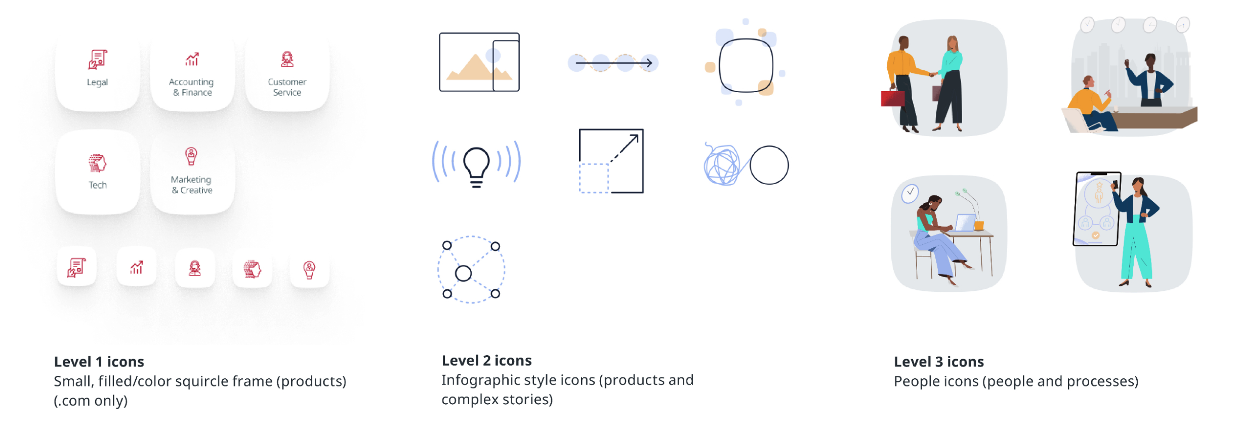
A new collection of icons with 3 use cases

And one of my favorite new add-ons: a new Illustration gallery.